Feeder 1.3 Tips: User Interface
This is the first in a series of posts exploring the new functionality in Feeder 1.3. I promised these a little while ago. These tips will also appear in the Feeder Tips & Tricks feed, which can be found on the Feeder product pages.
I thought I’d start with the first thing you notice when running Feeder 1.3 – its updated user interface.
User Interface
The user interface changes in Feeder 1.3 are focused around getting more out of the space on your screen.
- The one-pixel splitter allows the sidebar to be completely hidden, which could be useful if you only manage a single feed. Show or hide the sidebar by choosing View > Show/Hide Sidebar from the menu.
- The preview in the main window has been redesigned to show more of the actual content for proof reading and the status bar now shows the link the mouse is hovering over in the preview (if any).
- There is now an Edit Item toolbar button for the Library window – some people asked for this. You will need to customise the toolbar to see it.
- Feeder now does syntax colouring for HTML in the edit windows. You can change the colour of the tags in Feeder’s Editor preferences.
The Info drawer has been split into three different tabs to separate what is in the feed from Feeder’s own settings and reduce visual clutter:
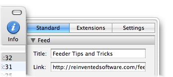
- The Standard tab shows fields for standard RSS 2.0 tags. Everything in this section is stored in the feed.
- The Extensions tab shows extensions to standard RSS, and everything here is also stored in the feed. The “iTunes Extensions” section that was in Feeder 1.2.x has now been split into two. The “iTunes” section shows everything that appears for your podcast’s listing in the iTunes Music Store. The “iTunes Information” section shows other tags that are not displayed, but used by the store.
- The Settings tab shows where the feed is kept on disk, and the feed’s publishing settings. These settings are stored in Feeder’s internal library.