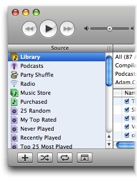
Like many people, I was a little aghast to see yet another interface style appear with iTunes 5, particularly one that isn’t available to everyone else and that has a few little quirks, such as the non-standard radius on the window corners and the way that the gradient starts at the top, ends at the source list then starts again below the lists. On the equaliser window, the same gradient goes from top to bottom – fair enough, but this indicates that the theme is more that just a background and (I suspect) unlikely to become available for everyone exactly as seen in iTunes should the new theme replace brushed metal.

But let’s hope it does, because many people will want to emulate the look and even the best implementations of BM appear a little scratchy next to iTunes now. Besides, the last thing we need is another interface theme in the long run. While I see the need for a device-like theme to limit the evolution of endlessly inconsistent skins, I’m no fan of brushed metal. I think it’s too heavy, too clunky, surprisingly dated and requires an incredible number of changes to standard controls to make them look good. Perhaps the best BM implementation is Safari, but even that has straight corners at the bottom of the window, which isn’t standard for BM windows where all four corners are usually rounded.
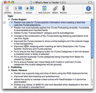
Overall, I think the new iTunes theme is a huge improvement, but that isn’t to say I’m totally enamoured with it. I spent most of yesterday being reminded of the Mac version of Windows Media Player, although looking at Windows Media Player again, it’s nothing like it (thankfully!). I also feel better about the iTunes look today, so perhaps it’s a grower. It helped after I updated Feeder’s iTunes preview (for release with 1.2.2 in a week or so) to see that looking much smarter. I wouldn’t expect BM to get replaced before Leopard, however, because of the problems that might cause with existing applications. We’ll see.

