Together 2.0 – New Features for Organizing
Over the next week, I will posting some more details about the new features and improvements in Together 2.0 (formerly KIT) in the hope that it will be useful for those who’ve upgraded and answer questions for those who either haven’t or can’t just yet.
Folders
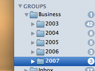
Since KIT’s initial release in 2004, people have been asking for folders, a hierarchy, sub-groups, etc. I mention the different terms because rather than a compromise, Together now has real folders that can be nested to your heart’s content and are mirrored in the Finder. At the same time, Together retains KIT’s groups, although they now have a different icon to avoid confusion.
 The challenge was to add folders while maintaining the existing functionality that was KIT’s appeal. KIT was based on applications like iTunes and iPhoto and doesn’t force a decision about where to store a file or drag some text for safe keeping, making it quick and easy to store files. This model includes groups that work like iTunes playlists, where a file can be in more than one group at a time.
KIT’s playlist-like groups will not work in a hierarchy (and the same applies to groups in Together). Dragging files to groups adds, rather than moves, the files. I contemplated having a file only exist once within a hierarchy or putting groups in pseudo-folders like iTunes these days, but it would only create confusion. Many things depend on a folder structure. A local copy of a web site is one example, lose the hierarchy and links will be broken, images will fail to display, etc.
So, in Together the solution is this: you can use it exactly as you used KIT. Drag to its library and the items will be stored automatically. You can still create groups and smart groups and items can be added to many groups, no matter where they are stored. In addition, you can now create and import folders. Files in folders still appear in the Library group and can still be added to groups, but will be stored in the actual folder. To store an item in the Library, rather than a specific folder, drag it to the Library.
Where
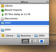
 Of course, with folders and multiple groups, you can often find yourself wondering just where an item is stored. In KIT, there was no quick way to see which groups items belonged to. Together introduces the “Where” view, shown as a new section in the Info view. This acts as a cross reference, showing all the groups containing the item.
Selecting a particular group or folder shows its path in the hierarchy and double-clicking selects the group in the source list and highlights the item. The Where view also shows the folder on disk where the original file is stored.
Tag Browser
 Another frequent request is a way to browse and manage tags. KIT could only find tagged items through its search field or using smart groups.
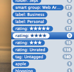
Just as you could see a list of groups in KIT, in Together you can switch that view to a list of tags. But there is more: folders, groups, labels and ratings can also be browsed as tags and this turns out to be a very useful alternative view of your entire library.
The list can be sorted by name, item count or kind and searched. Tags can be renamed and removed, dragged to items and vice versa. The system tags (folders, groups, labels, etc) can be hidden and switching between groups and tags is a single click. You can enable the system tags in the View Options panel.
These are just some of the new organization features in Together. Next: Searching.
December 4th, 2007 at 6:11 pm
I think the iTunes/Finder approach to orginization is spot on (no pun intended). I have grown to love the use of “playlists” and “smart playlists” used throughout the Leopard iApps to organize items (files/photos/mail/music). Your sidebar makes your software almost seamsless within the Leopard ecosystem. Additionally, the optional, hideable Tag browser is sure to make certain power users happy, without sacrificing simplicity.
I would like to seperate folders from the groups, though. I think (for me) it’s more intuitive and cleaner to have seperate groupings for groups (virtual links to files) and folders (physical location of files). So you would have “Library”, “Folders”, “Groups”, and “Trash” in the sidebar. Its nice to see you had a real thought process on what to include in the sidebar and how to implement it, it definitely shows.
Of course, seeing how this is an orginaizing app, it is hard to avoid comparisons with Yojimbo, which you have noted yourself. I think this setup you have created for 2.0, along with the smart groups with content search, are BIG differentiators for me. Amazingly, this is accomplished while maintaining a simple interface, which is key for Mac apps.
Once again, keep up the great work!