Together 2.0 – User Interface
This is the last in a series of posts highlighting some of the new features and improvements in Together 2.0, formerly known as KIT.
One of the most rewarding things about developing KIT is the number of compliments it received for its simplicity. When I first designed it, many apps of its kind were weighed down with interfaces full of clutter. I wanted the antithesis of that.
If you are a KIT user that hasn’t been able to use Together yet, with everything written so far you could worry that KIT’s simplicity will be lost. However, it has been my goal from the outset to maintain the simplicity while improving the overall experience. KIT users will find Together looks brand new yet reassuringly familiar.
Very little has been added to the interface. The toolbar now includes an Encrypt button, while the Info button has moved to the status bar at the bottom of the window. The status bar contains two new controls. On the left, is a control to switch between the groups outline and the new tag browser. And on the right…
Portrait View
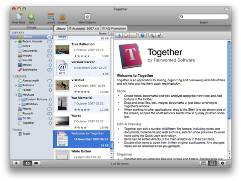
Most screens on today’s Macs use a widescreen format. To make the most of this, Together now has a portrait preview mode. In my testing, I found both portrait and landscape previews to have their uses, so you can switch between them easily. Here’s how the portrait preview looks (click for a bigger version):
In portrait view, the file list shows thumbnail icons with all the information alongside. The traditional columns don’t work well in portrait mode for obvious reasons. This way you can see about the same number of items and information about them as the landscape preview. Together uses Leopard’s Quick Look technology to generate thumbnails for most documents.
To make the most of the space in this mode, the Info view appears below the preview and each section gets its own tab. With the Info button now located in the bottom right, it’s more convenient to show or hide the Info view as needed. The thumbnail format ensures most information can be seen in the item list.
Tabs
As mentioned before, Together allows documents to be edited in the main window, and can edit file formats other than its own notes. Together uses a tabbed interface for editing multiple documents. This keeps things uncluttered and removes any confusion between documents open in Together and in other applications.
Of course, you can still edit documents in their original applications and there are preferences and modifier keys that can be used to determine what happens when items are double-clicked.
Shelf
KIT had a number of ways to import data from other applications, but each had some sort of drawback. Dragging to the groups list gave the best results, but the window had to be visible. The Services menu is buried and its nature imposes restrictions on the types of data it could properly handle, as did dragging to the Dock icon.
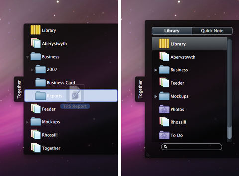
In Together, the answer is the Shelf, which appears as a tab on the side of the screen. Drag files or data here and a window will slide out with a list of groups and folders that can accept new items. Once the drag ends, the window slides back. However, unlike anything you have seen before, the Shelf has a few tricks up its sleeve.
Click on the tab to open the window and you’ll see groups and a search box. In this mode, the Shelf acts as a global browser for your library where you can browse groups, drag files to other applications and search. Files can also be opened in their applications or in Together, and you can also drag URLs, text or anything else to the Shelf, just as in Together’s main window.
The Shelf also has a Quick Note view. Here you can quickly enter a note without leaving the current application. The Shelf can also be opened in either mode using hot keys that work both within the app any in other application. The Shelf can reside at the top, middle or bottom of either side of the screen.
That’s It
That’s all for now. I originally wrote these posts for the run-up to releasing Together. My aim was partly to show off the app but also to answer some questions in advance, in the hope it would save me some support emails! 😀 However, events took over and I decided to save them until after the release. I’ve received some good feedback on these, so I’ll aim to post more tips in the future. Thanks for reading.

