In a post entitled, Satisfying UI Design is Often Illogical, Scott Stevenson defends recent changes to Leopard’s UI. Under a heading of “A Design Strategy” he writes:
So we need a fresh experience. What’s the criteria?
There are tens of millions of existing Mac users all over the world, and millions of new ones waiting in the wings. They need to an experience that is both brand new, and yet familiar. Stop short, and it will not spark the user’s interest. Go too far, and you may alienate your user base. So the task is finding the balance.
This is additionally complicated by the fact that Leopard must look like it belongs in the same universe as the iPhone, iPod, the Apple Store, and a wide range of Mac applications. It’s difficult (impossible?) to come up with something which satisfies all tastes, so compromises have to be made.
I think it’s a mistake, though, to assume that the shipping designs are ever reached via apathy for a particular audience. Finding the perfect balance is hard, but some version ultimately must ship to keep things moving forward. The goal, I think, is maximum user satisfaction for the target audience. This may mean making changes that some audiences would disagree with (because not everyone experiences things in the same way), but I really doubt it’s apathy.
However, rather than the subjective views to which he alludes throughout the post, much of the criticism about Leopard, voiced very consistently by developers and users alike, is that many of the changes actually degrade usability, making the user experience less satisfying.
Some examples:
- The new folder design makes it more difficult to recognise folders at a glance.
- The new Dock’s “lights” do a worse job at showing an app’s running status than the triangles in the previous versions of the Dock, by offering less contrast.
- Stack icons in the Dock make it more difficult to see which folder is represented.
- Stacks can only access a limited number of items in a folder before falling back to the Finder; the pop-up menu listing all items is gone.
- The menu bar is harder to read with some backgrounds.
You’ve read such a list a thousand times by now, I’m sure.
None of these things are so terrible that your Mac becomes unusable and overall Leopard looks good, but people expect better from Apple. The impression is that Leopard’s UI designers were unable to fuse form and function as well as we have come to expect. It’s both disappointment and frustration fuelling the complaints.
On the plus side, I would say Spaces, the unified window style, new Finder (undoubtedly my favourite change) and Spotlight results window are generally regarded as worthwhile improvements.
Taken as a whole, it appears more was lost than won with Leopard’s UI changes.
Scott ends with this:
If history can be used as a benchmark, the UI discussion cycle we’re currently in with Leopard is a natural part of the process. Any sort of change will bring disagreement from some users, but eventually it all settles down as people get used to it and various tweaks are made. That’s been my experience, anyway.
I would agree that some changes require an adjustment period and various issues will be addressed in time. Normally, this would happen in the next major version of the OS, but maybe we will see some changes sooner thanks to all the discussions going on.
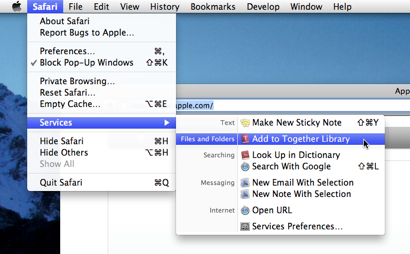
 You may notice that the Services menu has been cleaned up in Snow Leopard and this affects Together users. You can now choose which items to show and set shortcut keystrokes for the Services menu in System Preferences. Unlike the mess of before, Snow Leopard only shows the services that are relevant to the current selection.