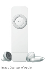
Friend and fellow Mac addict Claire was so pleased with her iPod Shuffle we asked her to write a review for this blog in the vain hope that she’d finally stop going on about it. 😀
 This world is a fickle one. We work hard, play harder, use our disposable incomes to buy disposable goods (who would ever have guessed that cars, TVs and stereos would be classed as disposable?). Life in the fast lane is too slow. Our culture bombards us with ever-moving images: we channel-surf the TV, flicking past the advertisements, walk past billboards that change every 20 seconds – we can’t be trusted to concentrate on anything for too long.
And let’s be honest, concentrating is a chore and committing to something for any period of time is hassle – why stay in a dead end job when you can career-hop? Don’t like the commitment of marriage? Wife swap. Even holidays, the epitome of relaxation, become a whistle-stop tour to prevent us from getting bored.
I have a short attention span. I like to think it’s a by-product of my supreme intelligence, but it’s more likely something to do with the brain cells I’ve killed with wine, vodka and beer. The problem is worse when it comes to music. Listening to an entire album can be so tedious. You find an album, stick it on, start to listen, realise the first song isn’t as good as you remember, skip a track, skip another and before you know it you’ve flicked through an entire album but only actually heard two songs in their entirety. It’s all just so ‘samey’, which is why teenagers the world over spend their time making compilation tapes (or these days, CDs from their MP3s – they don’t know they are born!).
 This must surely be one of the reasons why those clever boffins at Apple created the iPod Shuffle, a perfect accessory for modern life. Never again subject yourself to an entire album! Download some music onto it (either choose your own or let iTunes randomly select for you) – the Shuffle holds about 240 tracks, so you’ll have plenty of choice – pop in the earphones, hang it around your neck and turn it on. Don’t like the first track? Skip it. You can guarantee the next track will be completely different. Shuffling seamlessly through the playlist, the Shuffle delivers music to suit even the shortest attention span. Listen to Rock next to Pop next to Indie next to Dance – the only limits are those imposed by your iTunes collection.
The very, very best thing about the Shuffle is that you rediscover tracks that you love but had completely forgotten. It’s all one can do to refrain from screaming ‘Tune!’ as an old favourite comes bouncing through the earphones. The next best thing is its size, it’s so small and light, your average lighter will seem bulky. Sling the Shuffle around your neck and forget about it – you won’t get neck strain from this little beauty. The control wheel is so simple and intuitive you don’t need to take your eyes off the road and it has all the functions one could need – skip, repeat, play/stop and volume control. Marvellous.
Of course, being an Apple product and breathtakingly cool, it wouldn’t be complete without its own range of accessories with which you can pamper it (and yourself). As soon as I first used my Shuffle, I wanted an armband for running/cycling, and not content with that I’m pondering a protective case – must keep my baby safe. The Shuffle is so small and gorgeous it’s like having a little puppy that you simply must buy toys for, except you only have to take the Shuffle out for walks when you want to.
In this commitment-free, disposable world I’ve discovered something I want for keeps, something that positively encourages you to change your mind, something that even the shortest attention span can cope with. The iPod Shuffle – I love it.
– Claire

 This isn’t the first time I’ve managed to potentially offend an entire nation and maybe it’s not as bad as when I left Swedish off the list entirely. However, I received an email from Down Under, where Ian Graham of
  This world is a fickle one. We work hard, play harder, use our disposable incomes to buy disposable goods (who would ever have guessed that cars, TVs and stereos would be classed as disposable?). Life in the fast lane is too slow. Our culture bombards us with ever-moving images: we channel-surf the TV, flicking past the advertisements, walk past billboards that change every 20 seconds – we can’t be trusted to concentrate on anything for too long.
 This must surely be one of the reasons why those clever boffins at Apple created the iPod Shuffle, a perfect accessory for modern life. Never again subject yourself to an entire album! Download some music onto it (either choose your own or let iTunes randomly select for you) – the Shuffle holds about 240 tracks, so you’ll have plenty of choice – pop in the earphones, hang it around your neck and turn it on. Don’t like the first track? Skip it. You can guarantee the next track will be completely different. Shuffling seamlessly through the playlist, the Shuffle delivers music to suit even the shortest attention span. Listen to Rock next to Pop next to Indie next to Dance – the only limits are those imposed by your iTunes collection.