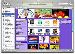
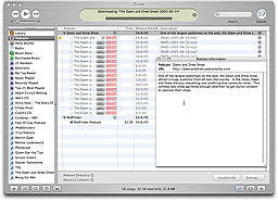
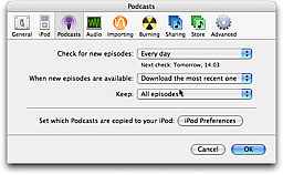
Ah, iTunes 4.9. Of course, everyone read the announcements on my news pages, in my news RSS feed and on this blog stating that Feeder would be supporting the iTunes RSS extensions, and tons of people haven’t flooded my inbox ever since to ask if it will be implemented, when it will be implemented, if there will be a charge, etc. Yeah, right. 😉 Seeing the futility of my actions, I’ve now plastered notices around Feeder’s product pages, but I don’t hold out much hope.
Actually, it’s great to hear how many people are interested in this and now I’ve got to grapple with the rather plain specification released by Apple yesterday and translate it into a smoothy and silky user interface that doesn’t look like you have to type the same thing at least three times in three different ways.
A few opinions popped up on the web about these iTunes extensions yesterday. Dave Winer thinks it’s “funky” in that it duplicates lots of information, Edd Dumbill thinks it’s somewhat disappointing and even NetNewsWire’s Brent Simmons thinks it could be better and will be revised.
I agree, but for now, we’re stuck with it. I want to be constructive about this. Some of the tags are great and no problem at all: explicit, duration and block. I can live with the predefined categories and understand that the images need to be a different size to fit into the CD artwork style boxes in the iTunes Music Store.
The first problem is that tag names which match those in RSS make it confusing to users and annoying to differentiate in the user interface. I’ve already had a few emails about this. With that in mind, “image” would be better named “artwork” and the “category” tag would be better as “genre”.
And then there’s the whole duplication thing. In particular, we now have two more versions of description at both a channel (i.e. feed or podcast) and item (i.e. episode) level: subtitle and summary. Subtitle is a short description, must be plain text and no more than 255 characters. Summary is a longer version, also plain text and up to 4000 characters in length. The subtitle appears in the lists and the summary appears alongside the artwork and in the Info window. You can’t omit the existing RSS description field, because existing podcatchers and newsreaders use that.
I think it would have been better if they added subtitle by itself and derived the summary by stripping the HTML from the RSS description or better still by taking the HTML description as is. I suspect all this duplication is because a) the contents of your feed is going to be stored in a database and / or b) the iTMS can’t handle HTML in its existing fields. Apple normally seems really good at taking existing technology and wrapping it up in user-friendly ways so you don’t need to worry about what’s going on underneath, but in this case the inner workings of the iTMS seem to be laid bare.
I hope the spec changes and will gladly rework to the new spec. In the meantime, I’ve really got no choice but to plough on. At least with Feeder’s templates, you can choose which fields to show and omit anything you don’t need. I’m also looking at ways to reduce the amount of duplicate data entry required. More information about how iTunes handles podcasts that don’t have these tags would also be useful. I think it’s early days and this will all come good in the end!


