Application Bloat a Problem of Perception
Friday, March 25th, 2005I tend to think that bloat in applications is often a problem of perception. For example, when Microsoft Word 6 was released on the Mac, the biggest complaint was how bloated it was, not to mention everything else, like being clunky and completely un-Mac-like, needing far too much memory and too slow.
Granted, Word has an awful lot of functionality for a word processor, but the v.X version seemed to solve most of the problems with improved performance and a streamlined interface; it looks remarkably more Mac-like and much better than the Windows version. Memory usage matters less these days for a variety of reasons, and this is A Good Thing because having stuff in memory is faster than getting it from disk. Some people still regard Word as bloatware and if you scratch the surface you can still find some quirks and occasionally too many dialog panels and tabs within dialogs, but I think for what it is and what it does, it’s an acceptably Mac-like experience. The point is it doesn’t feel anywhere near as bloated now, despite actually having more functionality than Word 6.
In Word 6’s case, bloat was a perception of excessive functionality causing slow performance. Excessive functionality can be the cause of performance problems, particularly with startup times, but these things can be worked around, for example, by optimising code and only loading things when you need them, not all at once. Word 6’s biggest problem was its user experience.
Now let’s look at iPhoto. Most people don’t consider this to be bloated and while it’s not always been regarded as the fastest app on the block it’s managed to stay within the threshold of acceptability for most people. It actually does an awful lot for what is supposed to be a digital shoebox – importing, organising into albums, slideshows, printable books, web publishing and some basic but increasingly more useful image editing features amongst other things.
Or take iTunes – a digital jukebox that imports and organises music, converts audio files, burns CDs, streams MP3 radio, syncs with iPods and other MP3 players, “transmits” and shares music over a local network and even integrates with its own online music store. Yet in no way do these apps come across as being bloated. They work intuitively and they’re focussed on the task in hand. In fact, they’re so easy sometimes people find it hard to believe that all you have to do, for example, is click the Burn button and pop a blank CD in your Mac. “Is that it?” they ask. Yep!
With these two iApps in mind, I’d like to narrow my definition of bloat now from excessive functionality causing poor performance to “unnecessary functionality”, which boils down to poor design. This is the one thing I really want to avoid in my apps – tricky when you receive so many feature requests, which sometimes conflict with each other. I want my apps to be as intuitive as possible while still being packed full of useful functionality and without any degradation to performance. I believe that you can have it all, but you need to put a lot of thought into achieving this. Good! That’s the fun of it.
I wanted to mention all this not only because it’s so interesting to me but also before I write about the future of KIT. Keep this in mind when you read that post.
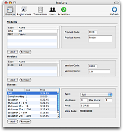
 The other side of things is taking care of the site and back end systems. Behind the scenes I have a system which integrates with PayPal and Kagi to accept payments and generate registration codes, send out lost codes, etc. Last week, despite me making no changes whatsoever, my server decided to stop talking to PayPal, which meant me doing everything manually until I could get it fixed. It turned out to be problem with my hosting company’s network, but it all adds to the workload. Incidentally, I’ve also got a front-end system called ReRegister (shown in the screenshot) so I can work with my online database in Cocoa comfort. Mostly these things save me time and allow me to stay in bed while the money pours (er, drips) in, so I shouldn’t be too huffy when things go wrong.