Feeder 1.2.2 UI Update
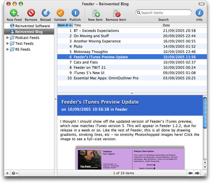
I mentioned the other day that I’d given Feeder a UI update. I don’t normally write about stuff before it happens because it’s like a kiss of death, but I’m hoping to release Feeder 1.2.2 tomorrow featuring (amongst lots of other cool stuff and some bug fixes) an updated user interface. Here’s a sneak peak, click the image to see a full-size version:
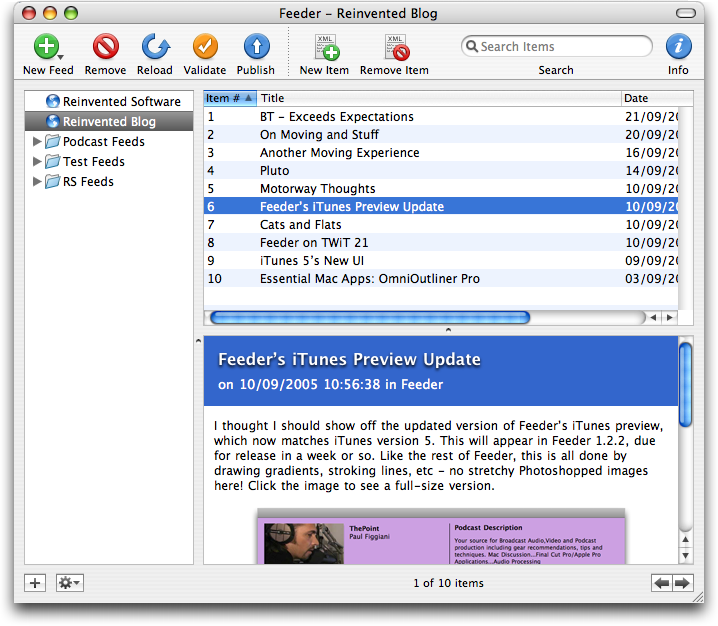
You can compare it with a screenshot of 1.2.1 here (the windows are the same size, so you could open them both in tabs to compare).
Fans of NetNewsWire will notice a very familiar gradient status bar with shiny buttons at the bottom of the window. I tried to make the whole status bar shiny, but it was a little overwhelming, Aqua stripes seemed out of place and a plain colour was too, er, plain. So I went with this. While all the buttons are original and the gradient drawn using CoreGraphics, Feeder was always designed to look like a newsreader application, which in turn, at least in NNW’s case, looks something like an email client.
Talking of NetNewsWire and UI updates, I agree with Brent’s analysis of UI trends, which he posted a couple of weeks ago, where he said:
- Stripes are passé.
- Margins are bad.
- Brushed metal is yesterday’s news.
- The unified title-and-toolbar look is the new platinum.
- The two-tone glass thing is big. Big, I tell you. Big.
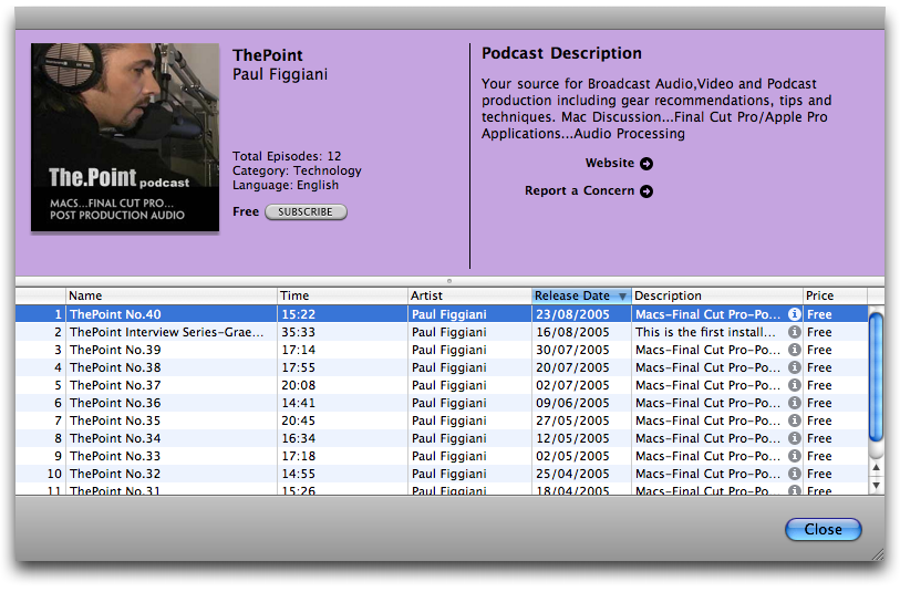
I admit that reading Brent’s post and seeing my own redesign of Feeder’s iTunes preview made it so I had to do this UI update now and not save it for a later version. I’ve been planning it for months but kept putting it on the backburner as time got squashed and things happened.
Feeder’s redesign is not only intended to be more pleasing on the eye: removing the margins makes more room for the actual content of the window and it paves the way for the inclusion of some new features in the near future. 😉
September 21st, 2005 at 11:09 pm
Nice! Great to see you’re adopting the unified look too 🙂
September 21st, 2005 at 11:17 pm
Nice work! Looks good!
September 21st, 2005 at 11:27 pm
Thanks – what fine company!
I definitely think the unified look is the way to go. The more I see it, the more I like it.