Feeder 2.0
 Feeder 2.0 is available today. This version adds many significant new features and enhancements including weblog integration, announcements, editing and preview improvements, live validation, Amazon S3 uploading, iTunes U support and an updated, improved user interface.
New User Interface
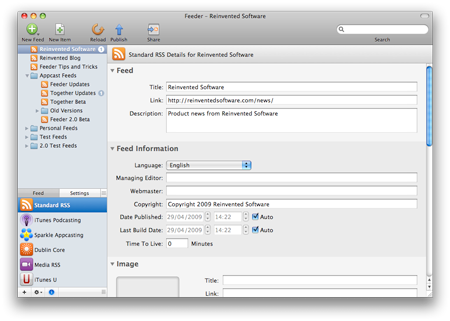
Feeder 2.0 has been redesigned to make working with feeds easier from start to finish. The toolbar is now less cluttered and shows a typical workflow, while the contents of Feeder’s Info drawer, which manages attributes and settings that applied to the feed as a whole, has moved to the main window.

The drawer approach worked well in the initial versions of Feeder, but didn’t scale very well as support for more RSS extensions was added. For new users, the Info drawer could appear intimidating with its sometimes cramped layout and small text, despite most of it being entirely optional.

Now, clicking the Info button below the source list shows a list of RSS extensions and choosing one of these will show all the details for that extension that apply to the feed as a whole. There’s another section for Settings that works the same way, but for things not stored in the feed itself. To get back to editing items, click on the feed or hide the Info view. The new Info sections are also searchable, both for field names and their values.
Editing & Templates
Editing items in Feeder has been improved in a number of ways. HTML syntax coloring has been improved and Feeder will now only check the spelling of the actual content rather than any HTML tags. The Insert Image panel now uses CSS styles to align and add decoration to the image and you can drag and drop files to the description area to immediately upload them to the web and insert the appropriate HTML image or link tags.
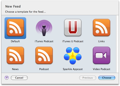
Feeder’s templates are now much more accessible. Feeds are based on templates, which determine which RSS extensions should be used, which fields to show in the editor and can also contain default values for things such as an author name or boilerplate text for the description.

In Feeder 2.0 choosing a template is the first step in creating a new feed and the template editor, which was once a panel that was probably ignored by most people, is now integrated into the item editor. By clicking the Template button, the editor switches to Template mode where you will see a list of extensions and all the fields for the selected extension. Click the checkbox next to a field to show it in the editor and set default values in the field itself.
Preview
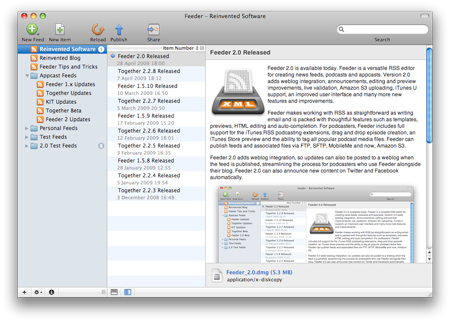
Feeder has always shown a preview of how your feed should look when viewed in a typical feed reader. Feeder 2.0 improves on this with the new portrait preview, which shows the list of items on the left and the preview to the right. This is how people will read posts on a web page and in most cases eliminates the need to scroll when checking your feed. The new preview style is much cleaner than before, too.
Post to Weblog
Many podcasters use Feeder to complement their existing weblog. Most blogging software has fairly limited support for podcasts, so Feeder gives full control over the feed, Apple’s iTunes RSS extensions and can automatically add the appropriate artwork and other ID3 (or equivalent) tags to media files before uploading everything to the web.
However, using Feeder in tandem with a blog was, at best, a clunky experience. You could post to the blog first, reload the blog’s feed in Feeder and drag the new post to your podcast feed, or publish with Feeder first, then manually copy the details into a blog post.
Either method has compromises. By posting to the blog first, you won’t be able to use Feeder to tag and upload the media files and the alternate approach is an exercise in cut and paste.
With Feeder 2.0, this problem is solved. You can create your episode in Feeder and in one click, upload the feed, media files and send the post to your blog. Feeder will also update posts that it has previously published. Feeder supports WordPress, Blogger and Drupal, the most popular weblogs for podcasters, but others should work too.
Announcements
Many people use Twitter and Facebook to announce new posts, so it seems fitting that Feeder should be able to do this for you too. After publishing, Feeder can post updates on Twitter and Facebook for the newly published content in your feed.
Amazon S3 Uploading
Amazon S3 is becoming a popular choice among those who want an affordable and dependable way to host large files. Feeder 2.0 now includes full support for publishing to Amazon S3 and working with S3 servers, including bucket and folder creation.
Share Panel
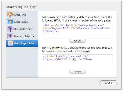
It can be difficult to know what to do with a feed after publishing it and this was not covered much in Feeder before. For example, most modern web browsers will auto-detect the presence of an RSS feed on a web page using a special HTML tag, but unless you know about that, you will be mystified.

In Feeder 2.0 things such as that are available in the Share panel, which Feeder can show after publishing a feed for the first time, and can be seen at any time by clicking the Share button in the toolbar.
And much more!
These are the highlights of the new features in Feeder 2.0 but just about every part of the app has been tweaked, polished and modernized. See the release notes for a full list of changes.
Feeder 2.0 requires Mac OS X 10.5 Leopard or later and costs $39. Feeder 1.x users can upgrade for $14.95 and anyone who purchased Feeder in the last 6 months qualifies for a free upgrade.
April 29th, 2009 at 6:10 am
Hi,
This is looking great, already ordered my upgrade. Looking forward to having a play with it. Some really nice features have been added to this version. Can’t wait to try some out.
Regards,
Stefaan