KIT: The Future
March 25th, 2005 by Steve HarrisIn some ways, it is more difficult for me to talk about KIT‘s future because a) I haven’t fully decided on everything yet and b) it lives on the fringes of quite a crowded and competitive market area. Showing all my cards might not be the wisest idea.
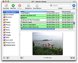
One of the problems with KIT at the moment is that it is just too flexible for its own good; you can’t just say it’s a note-taking application, an organising app or some sort of file management utility. My previous post, KIT: The Past, explains the reasons behind this, or the basis of its inspiration at least, but this factor makes KIT more difficult to market.
Before I released KIT I didn’t think it had any direct competitors, but it turns out that DEVONthink is an application that does much the same thing, albeit in a more complicated and less pretty way. Look more closely and these two apps are very different. I’m going to try to address the whole marketing aspect of KIT through refining its features and avoiding unnecessary feature bloat.
![]() Actually, while I think of it, Devon Technologies are obviously aware of KIT. I know this because they stole KIT’s Link icon for DEVONthink – I have the original artwork to prove it’s mine. There’s not much I can do about this and it’s only 32 pixels square, but even so. The icons in my applications, apart from the system-wide generic ones, are original.
Actually, while I think of it, Devon Technologies are obviously aware of KIT. I know this because they stole KIT’s Link icon for DEVONthink – I have the original artwork to prove it’s mine. There’s not much I can do about this and it’s only 32 pixels square, but even so. The icons in my applications, apart from the system-wide generic ones, are original.
Back to the point. This post aims to answer two questions: firstly, what is the future for KIT and secondly what will be the point of KIT on Tiger.
On the first question, there is plenty of room for improvement to the application as it is now in the following areas:
- More information about files.
- Better note-taking abilities.
- More file formats supported for previewing and indexing.
- More advanced searching.
- Improved Smart Groups.
- Interface and usability improvements.
I also hope to deal with the problem of KIT’s groups vs subfolders at some point.
With KIT on Tiger, and Apple’s NDA, it’s obviously even more difficult for me to divulge unless the information is already publicly available. Let’s deal with the problem of Spotlight and Smart Folders in the Finder – the two things that supposedly make KIT less attractive to Tiger users. Yes, I was a little perturbed when I saw these features announced and my unreleased but finished product did just these things to an extent. However, that’s cool because a) it at least means my ideas are so good Apple was thinking the same thing b) this technology is not solely available to Apple but to all developers and c) KIT is written in such a way that it can take advantage of that quite easily.
So eventually, in a Tiger-only version, you will see KIT fully take advantage of Spotlight technologies, searching will be even faster and Smart Groups more efficient and more flexible. There are other technologies in Tiger that will take the QuickTime support and PDF viewing to new levels, amongst many, many other things.
So KIT is not going to die any time in the near future, in fact its journey has only just begun. I have so many great ideas the only difficult part is trying to choose what to implement and when. Long live KIT!
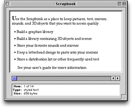
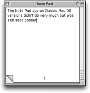
 I’ve always missed the Scrapbook and Note Pad desktop accessories (later apps) that came with Mac OS 9 and earlier. Fast to load, always available – perfect. At the time, they did exactly what I wanted them to do. You could drag and drop (or cut and paste) text, graphics, QuickTime movies, sounds, or anything really to the Scrapbook and it would store it away for you. The Scrapbook app was always available in the stripy Apple menu and when you needed something from it, you could just drag it back out again.
 When Apple took the decision not to ship either of these apps with Mac OS X, tens of replacement notepad apps appeared. I wrote one of the first of these called Notebook (before Circus Ponies’ Notebook and HogBay came out), which was available for the Public Beta. My version was free, and well received (free things that work usually are!), but it’s hard to write and maintain an app when you’re working more than full time on other things.
  Despite its simple exterior, KIT is actually quite complicated underneath, using a plethora of custom views (e.g. the iPhoto-like images with shadows), multithreading (to do indexing and large amounts of file copying) and wouldn’t have been possible without Cocoa’s bindings technology, which is why it will only work on Panther and how it works so fast and so well. It’s not unmanageably complicated however – I’m very proud that I took no shortcuts or easy ways out – it’s some of the best code I’ve ever written. Three days after I finished the coding (but a month or so before I released it – needed to do the website, registration system, help pages, etc) Apple announced Tiger and Spotlight and suddenly KIT didn’t look so useful after all.