Keep It 2.0

Keep It 2.0 is now available. This major new version adds Finder integration on Mac, Quick Open, Quick File, minimal web pages, the ability to reorder lists in the sidebar, a redesigned items list with favorites at the top, a streamlined UI for editing and viewing items on iPad and iPhone, redesigned text formatting controls on iPad and iPhone, instant search suggestions, improved PDF viewing and Markdown previews, improved linking between items, the ability to duplicate items, and much greater consistency between Mac and iOS.
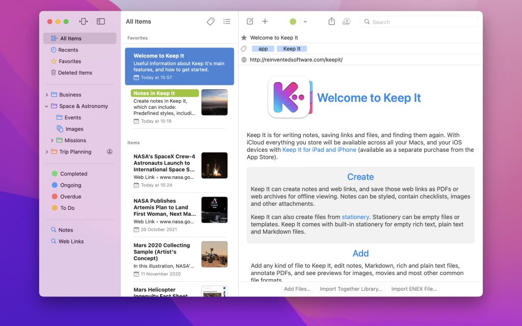
Finder Integration
On Mac, Keep It can now be shown as a separate location in the Finder’s sidebar, Go menu, and in standard Open and Save panels, making Keep It’s files easily accessible to other apps. Previously Keep It could expose its folders in the Finder and allow files to be added, opened and tagged there, but little else. With Finder integration, it’s now possible to do everything you normally can with files and folders, and see those changes reflected in the app.
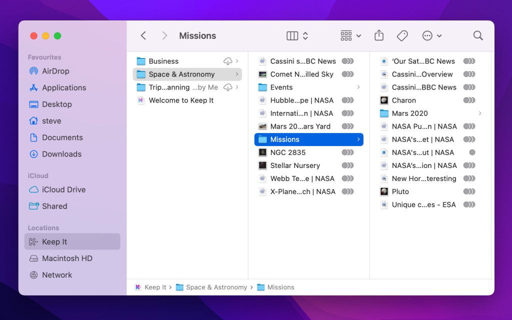
When Keep It is using iCloud, Finder integration also makes it possible for files to no longer be stored on your Mac to save space, while still appearing in the Finder, searchable by Spotlight, and backed up with Time Machine. When an app needs to access a file it will be downloaded automatically. Similarly, the system can now remove downloads when space is tight, or if the files haven’t been accessed in a while. By default Keep It always downloads items and doesn’t allow them to be removed, but this can be changed in its Advanced preferences when Finder integration is in use.
Finder integration will be enabled by default for new Keep It libraries; people upgrading from Keep It 1.x will be offered to enable Finder integration when first using Keep It 2.
Enabling Finder integration moves the files to a location managed by the system, and so it may break existing workflows that rely on Keep It’s files being in the legacy default location, and cannot be used with custom library locations. However, Finder integration solves issues such as the Preview app refusing to save the changes to files stored in Keep It 1.x’s default location — a common reason for using a custom location in the first place. That, along with the ability to offload content to iCloud to save space could mean a custom location is no longer necessary.
Keep It will continue to support the legacy default location and custom locations, and Finder integration can be enabled or disabled at any time.
Quick Open and Quick File
Quick Open and Quick File provide keyboard-driven ways to quickly open lists and items, and file items, on both Mac and iPad.
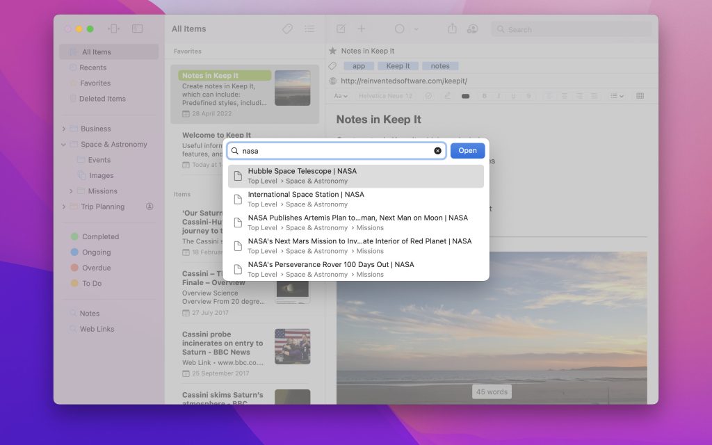
Press ⇧⌘O to show Quick Open on Mac or on iPad with a hardware keyboard. Quick Open allows you to open any item or list by typing its name. Select from the results using the up / down arrow keys, and confirm with the Return key. Quick Open can be customized to include both lists and items, or only items or lists.
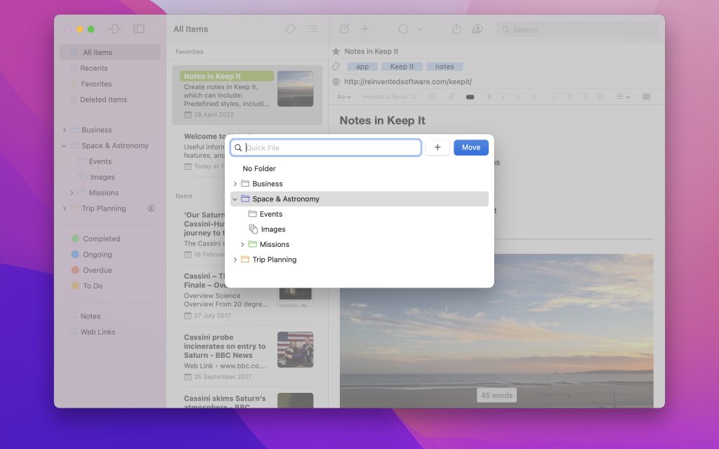
Press ^⌥⌘F to show Quick File on Mac or an iPad with a hardware keyboard, which allows you to file the selected items in any folder or bundle in the same way, and also conveniently navigate the hierarchy using the arrow keys.
On Mac, Quick File can also be accessed from an optional toolbar item, and will be shown when choosing Add To Bundle or Move to Folder while multiple items are selected. On iPad and iPhone, the Move to Folder, Add to Bundle, and Change Label sheets are now searchable.
Lists
It’s now possible to manually reorder folders, bundles and nested saved searches in the sidebar, and this ordering will be used everywhere those lists are shown.
Nested bundles, folders and saved searches whose view settings have not been customized will now inherit their parent folder’s settings, if customized, rather than always inherit their settings from All Items.
Items List
The items list has been redesigned to make more use of the available space in both list and icon view.
In List view, the name and summary wrap for up to four lines with the thumbnail alongside both, which allows for a larger thumbnail. Below the name and summary you can see file information such as the date, size, iCloud status, and the container bundle or folder of the item if appropriate, all on a single line.
Icon view now shows thumbnails for documents using as much of the available width as possible, rather than the full height of the thumbnail; images and file icons for items without thumbnails are still shown in full.
In either view, favorite items can now be shown at the top of the list, items can now be duplicated, and the iCloud status icon is now more specific, indicating whether an item is pending an upload or download.
Search
It is now possible to find items with checklists, and notes, rich text documents or PDFs with highlighted text, including specific terms in that text.
When focus moves to the search field, a number of suggestions are shown immediately, allowing you to quickly find items with checklists, highlighted text, attachments, shared items, etc. On Mac, Ctrl-clicking or right-clicking suggestions will show alternatives; on iPhone or iPad, show alternatives with a long press.
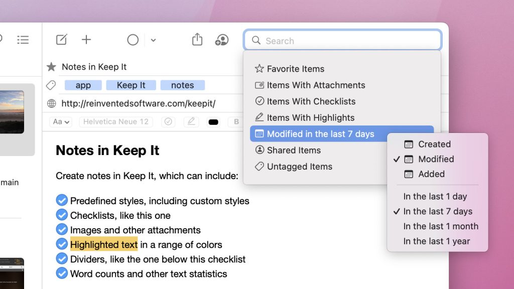
To match Keep It for iPad and iPhone, search suggestions on Mac are now shown with icons, and search tokens are now similarly shown as icon and text.
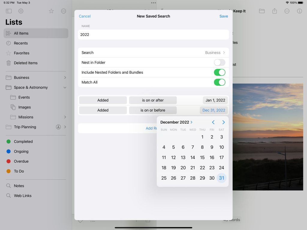
The saved search editor on iPad and iPhone has been redesigned to work similarly to Mac, with pop-up buttons and similar rules grouped together.
Streamlined UI on iPad and iPhone
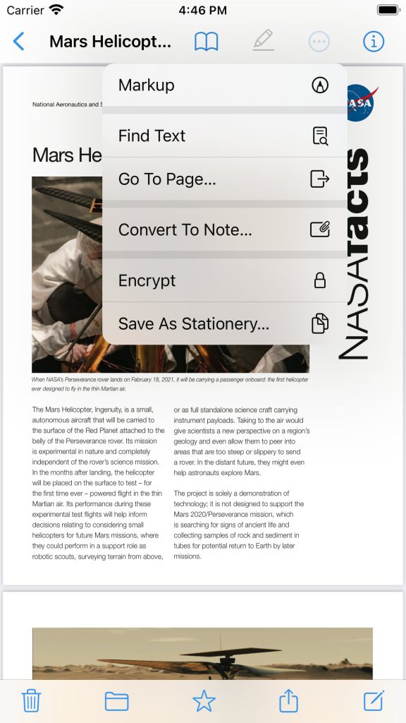
Editors and previews on iPad and iPhone now include an action button that shows a menu. This makes it quicker to access features that work directly on the file, and removes clutter from the Share sheet.
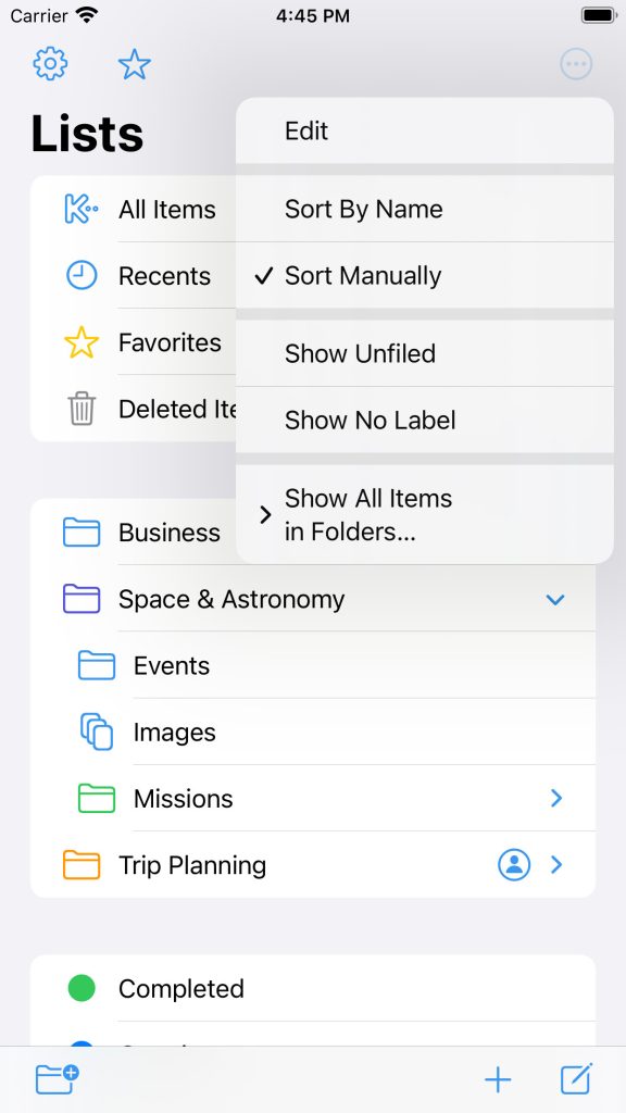
Similarly, there is now an action button above the Lists view where you can control how lists are sorted, show or hide the Unfiled and No Label groups, and change when folders should show all items in nested folders and bundles.
Notes and Text Editing
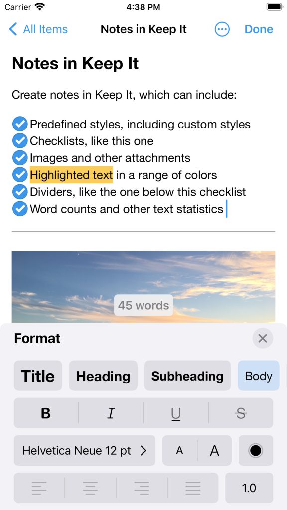
On iPad and iPhone, the format view has been redesigned to show note styles, lists, colors, and other formatting controls in one place. It’s now also possible to change line and paragraph spacing in the format view.
On Mac, whether you’re editing notes, rich text files, Markdown files or plain text files, the word count will hover over the text (as on iOS), rather than in the format bar. The width of the text editing area is now automatically constrained when editor windows are made full screen.
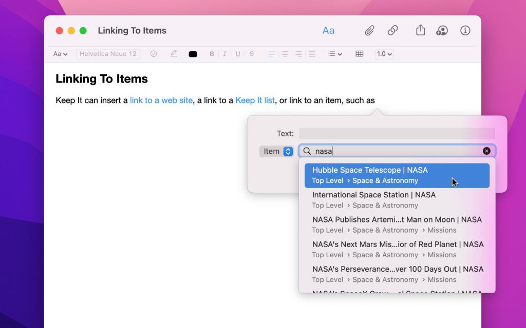
It’s now possible to insert a link to another item in Keep It by searching for it, without needing to copy and paste the link, or drag and drop the item into the text.
Notes and editable text items that link to the current item are now shown in the Show In menu on Mac and iPad, and the Where line in the Info view on Mac, iPad and iPhone — choose one of the related items to navigate to it.
Choose whether to show small, medium, or large margins when editing notes, rich text and Markdown documents. Edit the alignment, line and paragraph spacing of built-in and custom note styles.
Empty rich text, plain text or Markdown files created from stationery will now be automatically deleted if they haven’t been renamed when you close the editing window or navigate away from them, the same as empty Keep It notes.
Web Links
Web pages can now be viewed in Reader mode, and web pages can now be automatically saved for offline in a minimal format like Reader mode, when possible. Web links that have either been saved in a minimal format, or can be viewed in Reader mode, can now also be converted to editable notes. When hovering over a link on a web page on Mac, the URL will be shown.
PDFs
When viewing a standalone PDF you can now show a list of thumbnails to quickly navigate the document, and use those thumbnails to rearrange, remove or rotate pages. And, if the PDF includes one, an outline of the document’s contents can also be shown.
And More…
Markdown previews can now include task lists. Keep It’s tags now integrate with the Files app on iPad and iPhone. Both apps also include numerous small tweaks and improvements to make Keep It more polished and consistent across Mac, iOS and iPadOS while honouring each platform’s unique conventions. For a full list of changes see the release notes:
Upgrades, Pricing & Availability
Keep It for Mac is available for $59.99 directly from Reinvented Software or the Mac App Store, and both offer a free trial. Existing Keep It 1.x customers can upgrade for $29.99, unless they purchased Keep It 1.x in the 12 months before Keep It 2.0 went on sale, in which case the upgrade is free. Alternatively, Keep It for Mac is also available with yearly or monthly subscriptions at $19.99/year or $2.49/month only from the Mac App Store. Keep It for Mac users who do not wish to upgrade can continue to use Keep It 1.11.16 by downloading it from this site. Keep It for Mac requires macOS 11.3 or later.
Keep It for iPad and iPhone is available separately from the App Store with a choice of yearly or monthly subscriptions at $11.99/year or $1.49/month. Keep It for iPad and iPhone requires iOS 15 or later.