October 5th, 2005 by Steve Harris
NewsGator has acquired NetNewsWire along with Ranchero’s other assets, such as MarsEdit and Brent Simmons himself. I can see how this is a good thing, reading all those things they want to do with NNW but can’t because they are just two people and there are only so many hours in the day. Also, reading drunkenbatman explain a few things about the situation, I can well understand how support for such successful products could be overwhelming – particularly for MarsEdit.
On the support, it went without saying as far as I was concerned. My own fun, fun, fun with FTP / iTunes support issues has taught me that, even on a small scale, you can have a product that works exactly as it should, but once it starts integrating with something else, particularly server software, you enter a whole new world of pain: different configurations and versions along with user understanding issues that can devour whole days in the blink of an eye.
Anyway, well done to Brent and Sheila! Here’s hoping this makes their lives that much easier and both their lives and products that much better.
September 23rd, 2005 by Steve Harris
I released Feeder 1.2.2 yesterday. This version is more like the Feeder 1.2 I originally planned before iTunes 4.9 came charging in with its podcasting extensions. I’m really happy with this version.
One cool feature request that came quite late in the day was to support Ranchero’s External Weblog Editor interface so news items can be sent to Feeder using “Post to Weblog” in NetNewsWire. I thought I’d have to defer this until the next release but when I looked into it I could see it was so simple to do, I coded and tested it in all of 30 minutes.
Feeder isn’t a blog editor, but quite a few people have written in saying they want to use it to post RSS feeds on their sites with links to news on other sites that they’re interested in – actual syndication. Feeder already supported the RSS clipboard format for drag and drop / cut and paste, but this weblog editor interface is much more convenient – just choose “Post to Weblog” in NetNewsWire and the item is added to the selected feed in Feeder. You also get more information than the clipboard format.
Apart from NetNewsWire, I know that PulpFiction and Shrook support this interface and Feeder works well with them. NewsFire supports the interface too, but rather than let you choose a blog editor in an Open panel, it has a preset list and Feeder obviously isn’t on it.
I might do a Feeder tips post sometime soon. There is lots of stuff in there people probably don’t know about.
September 21st, 2005 by Steve Harris
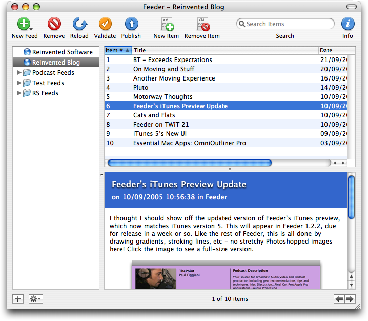
I mentioned the other day that I’d given Feeder a UI update. I don’t normally write about stuff before it happens because it’s like a kiss of death, but I’m hoping to release Feeder 1.2.2 tomorrow featuring (amongst lots of other cool stuff and some bug fixes) an updated user interface. Here’s a sneak peak, click the image to see a full-size version:
You can compare it with a screenshot of 1.2.1 here (the windows are the same size, so you could open them both in tabs to compare).
Fans of NetNewsWire will notice a very familiar gradient status bar with shiny buttons at the bottom of the window. I tried to make the whole status bar shiny, but it was a little overwhelming, Aqua stripes seemed out of place and a plain colour was too, er, plain. So I went with this. While all the buttons are original and the gradient drawn using CoreGraphics, Feeder was always designed to look like a newsreader application, which in turn, at least in NNW’s case, looks something like an email client.
Talking of NetNewsWire and UI updates, I agree with Brent’s analysis of UI trends, which he posted a couple of weeks ago, where he said:
- Stripes are passé.
- Margins are bad.
- Brushed metal is yesterday’s news.
- The unified title-and-toolbar look is the new platinum.
- The two-tone glass thing is big. Big, I tell you. Big.
I admit that reading Brent’s post and seeing my own redesign of Feeder’s iTunes preview made it so I had to do this UI update now and not save it for a later version. I’ve been planning it for months but kept putting it on the backburner as time got squashed and things happened.
Feeder’s redesign is not only intended to be more pleasing on the eye: removing the margins makes more room for the actual content of the window and it paves the way for the inclusion of some new features in the near future. 😉
September 21st, 2005 by Steve Harris
I write the title of this post in jest. I originally thought BT could have moved my broadband to the new house within 5 working days of me requesting it. They called today and told me it would be 5 working days after that phone call, i.e. next Wednesday, the 28th. The connection is still working in the flat, so if it holds up I’ll be moving out next Tuesday. If it dies in the meantime, I’ll move out then and improvise. How can it take so long, I ask you?!
September 10th, 2005 by Steve Harris
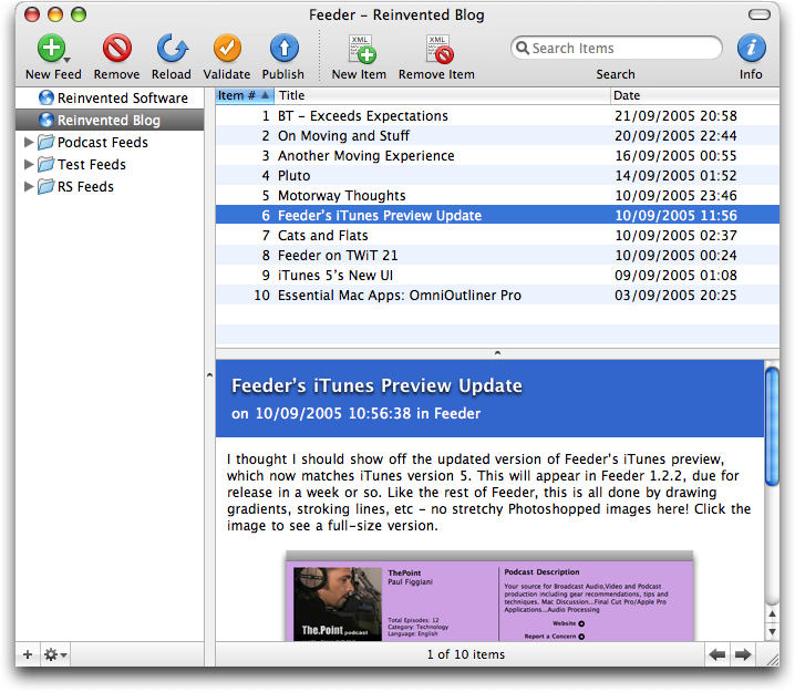
I thought I should show off the updated version of Feeder’s iTunes preview, which now matches iTunes version 5. This will appear in Feeder 1.2.2, due for release in a week or so. Like the rest of Feeder, this is all done by drawing gradients, stroking lines, etc – no stretchy Photoshopped images here! Click the image to see a full-size version.
I’ve also given Feeder’s UI a bit of a revamp, but that could still be in progress so I’ll save it for another day. 😀