Together 2.0 – Importing
November 22nd, 2007 by Steve HarrisThis is the fourth in a series of posts highlighting some of the new features and improvements in Together 2.0 – formerly known as KIT.
In this post we’ll look at some of the changes to do with importing files into Together.
Import by Moving Files
KIT offered two options for importing files, you could make copies or link to the original files using aliases, which keep track of those originals.
Together now adds the ability to move files. In this mode, files and folders are first copied then the originals removed.
Background Importing
Importing items into KIT would cause the application to be blocked by a progress sheet and would require you to wait before making another import or working with any of the imported files.
Together moves importing to the background, leaving the app responsive. An activity window, much like the Finder’s copy window, shows progress and alerts. Progress is also shown in the source list.
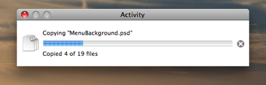
This background importing offers another advantage too. In Leopard (at least so far) showing sheets, such as a progress sheet on a window, brings that window to the front and, if you’re using Spaces, will make the window’s space active. That isn’t so good when you want to keep an application in the background or in another space. Together’s background importing means it is not affected by these problems.
Import Emails, iCal Events
Dragging messages from Mail into KIT has long been a request for KIT, but unfortunately Mail didn’t allow emails to be dragged to other applications.
However, Mail on Leopard does allow this and likewise, iCal allows events to be dragged. Together can preview both of these using Quick Look.
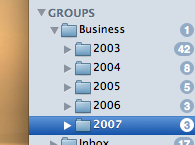
Recent Imports
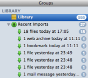 KIT could show the last set of files imported and collect together everything imported while the application was inactive. Together goes much further, allowing for up to the last 100 import sessions to be tracked in their own import groups.
Each group is named to reflect what was imported and when, for example “10 files today at 10:01am” or “1 mail message yesterday”.
Together lets you choose how many recent imports to keep in its View Options panel, and individual import groups can be removed at any time.
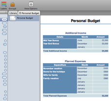 The feature requests for KIT that I would dread the most were those that requested support for a particular file format. I would love for it to happen, but most often the formats were either completely undocumented and / or fiendishly complicated. Excel spreadsheets, Keynote documents, OmniGraffle diagrams. KIT could store and search these, but as for previewing, forget it!
 The challenge was to add folders while maintaining the existing functionality that was KIT’s appeal. KIT was based on applications like iTunes and iPhoto and doesn’t force a decision about where to store a file or drag some text for safe keeping, making it quick and easy to store files. This model includes groups that work like iTunes playlists, where a file can be in more than one group at a time.
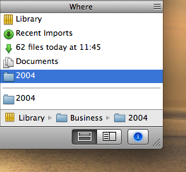 Of course, with folders and multiple groups, you can often find yourself wondering just where an item is stored. In KIT, there was no quick way to see which groups items belonged to. Together introduces the “Where” view, shown as a new section in the Info view. This acts as a cross reference, showing all the groups containing the item.
 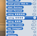 Another frequent request is a way to browse and manage tags. KIT could only find tagged items through its search field or using smart groups.